Flúor Design
 
Facebook
Behance
Google+
Linkedin
YouTube
 
PT |
EN
Work
About
Contacts
Filter work
All / Print / Identity / Motion / Digital / Proposal / Packaging / Editorial / Exhibition / Communication
Our Advises
2020
schools with energy
tba brand identity
fimfa 19
thales portugal 2017
LEGU packaging
xico
solvay business park
fimfa18
Reasons and Emotions
tarumba site
editorial tarumba
gresso chef
gep
advent calendar
solvay blanes 50
mnac sedution
fimfa 2017
2016/2017
antonio soares
mnac avant garde
solvay link
surrealism portugal
teresa alecrim
Odebrecht Report
sweet sixteen
Portuguese saudade
fimfalx 2016
cookbook
 
Pambom bakery packaging
Want a similar solution? Contact us >

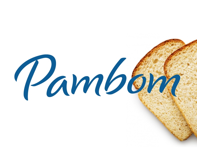
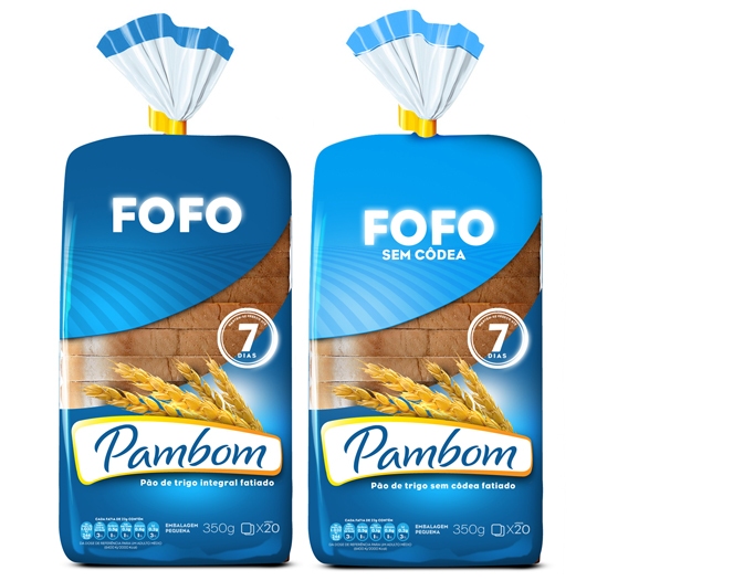
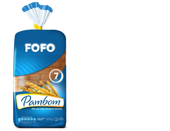
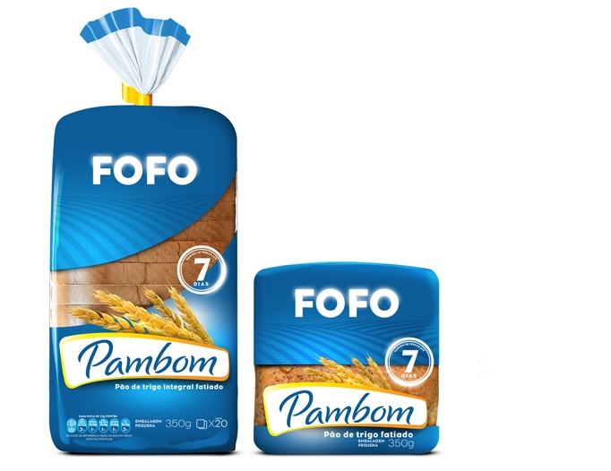
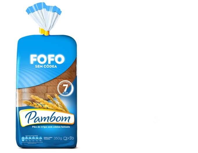
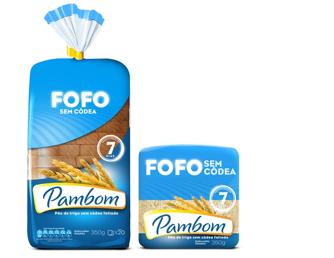
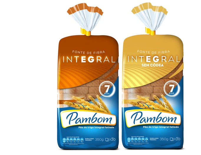
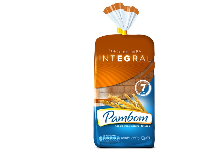
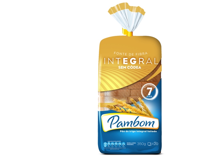
This was a proposal created by Fluor Studio, as a response to a challenge by a client of the food distribution sector. The goal was to create a new bakery brand that would work as a challenger to the two dominant brands in the market (Panrico and Bimbo) This would be a product only sold in their supermarkets, without the insignia of the umbrella brand thus making the differentiation and functioning as an alternative to their own white label.
A naming was created - Pambom (good bread) - as well as an identity and the packaging for four products: "fluffy/soft” (normal), "no crust", "Whole wheat" and "Whole wheat without crust". Graphically a very strong blue is the dominant color of the range and there is a complementary / differentiating color for the remaining products: light blue, copper and gold.
This proposal was presented in October 2013

Pambom bakery packaging
Back to top