Flúor Design
 
Facebook
Behance
Google+
Linkedin
YouTube
 
PT |
EN
Work
About
Contacts
Filter work
All / Print / Identity / Motion / Digital / Proposal / Packaging / Editorial / Exhibition / Communication
Our Advises
2020
schools with energy
tba brand identity
fimfa 19
thales portugal 2017
LEGU packaging
xico
solvay business park
fimfa18
Reasons and Emotions
tarumba site
editorial tarumba
gresso chef
gep
advent calendar
solvay blanes 50
mnac sedution
fimfa 2017
2016/2017
antonio soares
mnac avant garde
solvay link
surrealism portugal
teresa alecrim
Odebrecht Report
sweet sixteen
Portuguese saudade
fimfalx 2016
cookbook
 
don pavili gelateria
Want a similar solution? Contact us >

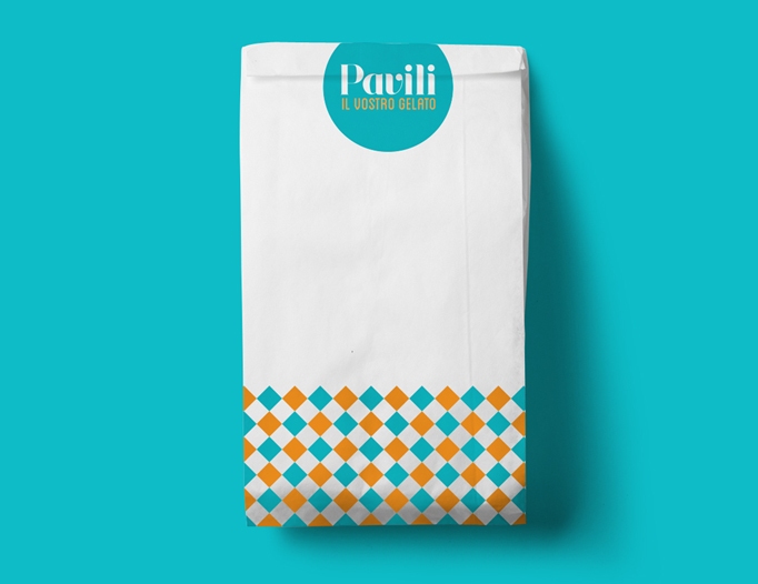
Fluor was the studio responsible for the identity design and graphic mood to artisanal gelateria Don Pavili in Oeiras, Lisbon. The briefing for the creation of identity includes the concepts of tradition, contemporary, unique and exclusivity in the handmade ice cream universe. To reinforce the idea of exclusivity, we started by develop one typography based on the fluid movements of the ice cream and the wands used to mix it.
Don Pavili is composed by the principal name identity "Pavilli”, the auxiliary typography "Don" and the auxiliary elements to the brand: "Est. 2015 "and" Gelato Artigianale ".
The color code works in antithesis, blue ice as the main color and warm orange as a secondary color.
For the communication were developed several patterns that complement and reinforce the identity.
Formally the patterns can be applied randomly in various store communication pieces such as bags, cups, ice cream boxes, stickers and all corporate communication.

don pavili gelateria
Back to top