Flúor Design
 
Facebook
Behance
Google+
Linkedin
YouTube
 
PT |
EN
Work
About
Contacts
Filter work
All / Print / Identity / Motion / Digital / Proposal / Packaging / Editorial / Exhibition / Communication
Our Advises
2020
schools with energy
tba brand identity
fimfa 19
thales portugal 2017
LEGU packaging
xico
solvay business park
fimfa18
Reasons and Emotions
tarumba site
editorial tarumba
gresso chef
gep
advent calendar
solvay blanes 50
mnac sedution
fimfa 2017
2016/2017
antonio soares
mnac avant garde
solvay link
surrealism portugal
teresa alecrim
Odebrecht Report
sweet sixteen
Portuguese saudade
fimfalx 2016
cookbook
 
Generg identity proposal
Want a similar solution? Contact us >

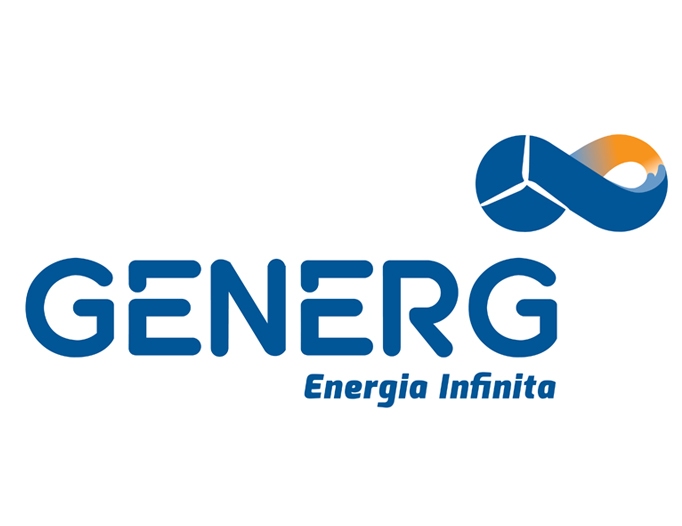
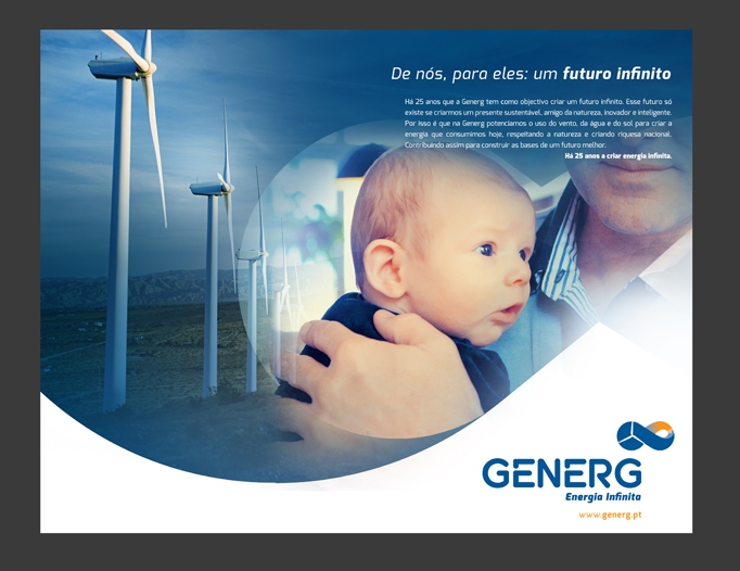
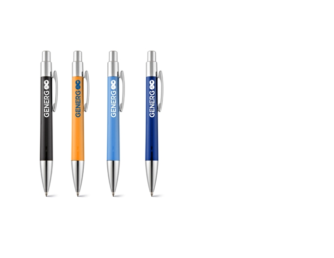
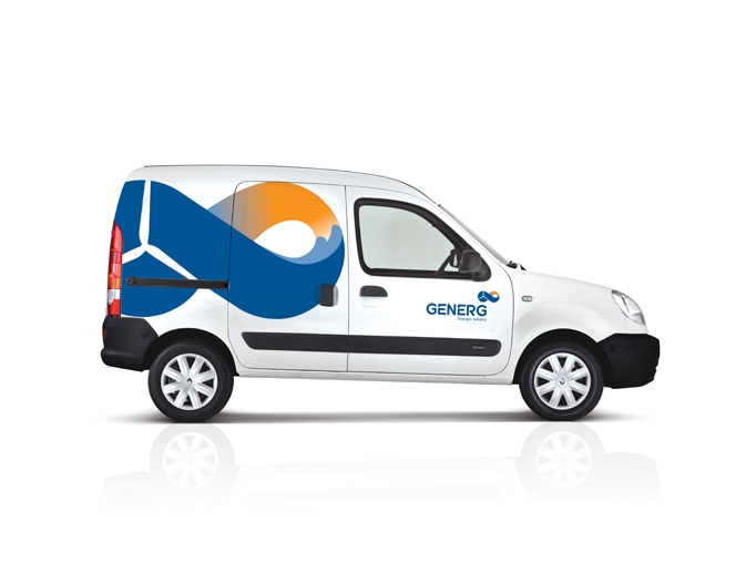
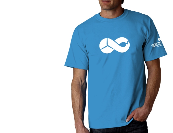
This proposal was presented in September 2013 for the redesign bid of the identity of Generg (Portuguese renewable energy company).
In the briefing there were three impositions that would have to be met: keep the blue and a similar typography from the previous identity, and the symbol created for the logo should include the main sources of energy worked by Generg: sun, wind and water.
The concept created aimed to provide more than just a portfolio of renewable energy, we wanted to show an idea and not a set of attributes.
The wind doesn’t stop, the force of the water is constant, the sun does not fade. Nature is infinite, and so the energy created by it, assuming that is harnessed, is too.
We also submitted a set of solutions and applications to follow and reinforce this concept.

Generg identity proposal
Back to top